The Drop Zones panel is used to "drop" your Dimensions and Measures onto your visualization. There are several different types of drop zones; each driving a corresponding component in the visualization. The selected visualization type determines which drop zones appear. For example, the Grid visualization enables the Rows and Columns zones (red), while Cartesian charts enable the Category zone.
To learn more about how the drop zones drive the visualization, and how the visualization also drives the drop zones, click here.
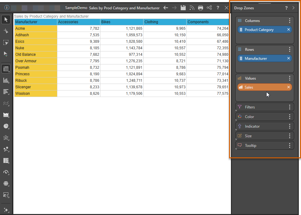
Drop Zone panel
To learn about each of drop zone types, continue reading through the current topic.
- Values: measures are placed in the Values zone, which drives the quantitative data in the query.
- Columns and Rows: arrange hierarchies and measures according to where they should be located in the grid.
- Category: add a hierarchy to display it on the x-axis of the Cartesian chart.
- Trellis: display multiple Cartesian charts or gauges driven by the given measure or hierarchy.
- Color: add a color component, driven by a measure or hierarchy.
- Color Logic: select the color logic from the Color zone menu; this logic will drive the color of the given measure.
- Custom Colors: define custom color logic.
- Advanced Colors: KPI dynamic bands and colors.
- Size: drives the size of the visualization's segments or cells according to the given measure.
- Shape: drives the shape of the data points in the visual. Available for scatter, bubble, line, point, lollipop, area, and stream charts.
- Labels: label the chart with a measure other than the measure of actual data point.
- Tooltip: drives the tooltip in the visualization.
- Indicator: visualize the status of a given measure for each data point in a grid or gauge.
- Status Indicators: select the required status indicator from the submenu of the Indicator/ Status drop zone.
- Status Indicator Logic: the given logic will drive the indicator in the visualization.
- Motion: adds visual animations to the chart.
- Details: add multiple member hierarchies to scatter, advanced (except Sankey and word), and bubble map charts.
- Mapping: add geo-location hierarchies or longitude and latitude measures to the Map Location zone to build maps.
- Filters: add 'slicers' or data driven filters to the query.
- Date Calendars: a specialized slicer for date / time columns.
- Tree Slicers: a specialized slicer for tree structures in MS OLAP, Tabular, and BW models.
- Slicer Limits: understand and act on the slicer limit indicator where too many results are returned.
- Cascading Slicers: comprise multiple filters from different hierarchies within the same dimension.
- Slicer Settings: determine the way the slicer is visualized, the way it operates, and how it is styled.
- Slicer Styles: set styling preferences for the slicer elements.
- Slicer Formatting: filter queries using hierarchy elements from the data model
- Background Filters: used to filter the entire query using single elements.
- Bookmarks: bookmark slicer selections so they can be re-used in Discovery reports.
- Pre-Query Slicers: set the default selections for slicers and parameters when the Discovery opens.
- More Drop Zone Options: use the chip and drop zone context menus for common functions, including sort, filter, and more.